DE X INSIGHTS
Digital Glazed Vitrified Tiles: A Practical Chennai Guide

You're standing in a Chennai tile showroom with a floor plan folded in your hand and three samples that look almost identical under bright lights. One is glossy marble-look GVT, another is double charge vitrified, and a third is a cheaper ceramic tile. The salesperson is talking about “full body”, “premium finish”, and “double charge” while you're trying to imagine the same surfaces after years of humidity, monsoon water, daily mopping, and furniture movement.
That confusion is understandable. Digital glazed vitrified tiles can offer a convincing stone or wood appearance with a dense vitrified body, but they aren't automatically the best choice for every room or every budget. In a Chennai home, the right decision depends on where the tile will be used, how often it will get wet or dirty, how much impact it will take, and whether the extra design value justifies the spend.
A Chennai Homeowner's Tile Dilemma
A new apartment owner recently showed me three samples for a living room. The first was a polished digital GVT with dramatic marble veining. It looked expensive and reflected the showroom lights beautifully. The second was a double charge vitrified tile with a quieter pattern. The third was a basic ceramic tile intended for walls, but its colour looked perfectly acceptable from a distance.
The sales pitch made each option sound superior. “This is premium.” “That one is full body.” “This has double charge.” None of those phrases answered the practical questions: Will it become slippery during Chennai's wet months? Will a chipped edge look obvious? Will the apartment association accept the thickness and finish? Will the floor still look organised after years of mopping, dining chairs, sofa movement, and grit brought in from outside?
The three competing priorities
Appearance is where digital GVT is strongest. Digital printing creates marble, granite, wood, cement, and patterned surfaces that can make a standard apartment feel more finished without the upkeep associated with natural stone.
Durability is more complicated. The vitrified body gives GVT low porosity and good resistance to stains and moisture, but the visible design is carried by the glazed surface. A deep edge chip can expose the body underneath. Full-body vitrified tiles handle visible wear differently because the colour and material continue through the tile.
Budget needs a room-by-room answer. Spending more on a high-visibility living room can make sense, particularly when the flat's builder-grade finish feels bland. Spending the same amount in a storeroom or a bedroom may be over-specification.
Practical rule: In Chennai, choose the tile for the room's actual risk, not for the showroom sample alone.
The Indian market is moving towards more premium, value-added surfaces. One industry analysis projects glazed vitrified tiles to rise from 28% of the Indian ceramic tile market in FY19 to 45% by FY29, while the overall market is projected to expand from ₹360 billion to ₹769 billion over that period, according to the industry analysis published by Sakar Marble. That growth makes the category important, but it doesn't make every premium tile a sensible purchase.
What Digital Glazed Vitrified Tiles Actually Are
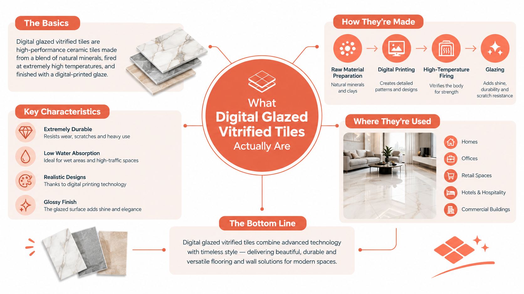
Think of a digital glazed vitrified tile as a layered cake.
At the bottom is the vitrified body, made from a dense blend of clay, silica and other mineral materials. During manufacturing, the body is pressed and fired until the particles fuse into a compact substrate. Under the Indian BIS framework, glazed vitrified tiles are assessed within IS 15622, with the high-durability vitrified body class, Group BIa, defined by water absorption of ≤ 0.5% in the relevant classification, as explained in this guide to IS 15622. Low absorption helps the tile resist moisture penetration, staining and dimensional movement better than porous ceramic.
The next layer is the glaze. It gives the surface its colour, texture and finish. In a digital GVT, high-resolution inkjet printing places the visual pattern onto this glazed surface before firing. A marble-look tile can therefore reproduce veins, tonal shifts and stone-like variation without relying on a simple repeated screen pattern. The print can imitate wood grain, concrete, terrazzo, granite or decorative motifs.
The top layer is the finished surface, which may be glossy, matte, satin, sugar, lapatto or textured depending on the product. Some tiles receive additional surface treatment to support the chosen appearance and cleaning behaviour.
Why the layers matter
The design is surface-deep, not body-deep. If a corner chips during cutting, installation or furniture movement, the underlying vitrified body may become visible. The tile still retains the low-absorption performance of its substrate, but the visual repair is harder when the printed surface has a strong contrast with the body.
That's the key difference from full-body vitrified tile. In full-body products, the material and colour continue through the tile, so minor chips can be less visually obvious. Double charge tiles also place a thicker design layer into the upper portion of the body, giving them an advantage where abrasion and impact matter more than intricate pattern variety.
In practical terms, GVT describes the tile category, while “digital” describes the design application method. PGVT refers to a polished glazed surface, whereas DGVT commonly refers to digitally glazed vitrified tiles, often with matte or textured finishes. The body performance comes from vitrification. The design flexibility comes from digital printing.
Finishes, Sizes, and Thickness Options Worth Knowing
The finish matters more than the word “GVT” on the carton. A polished digital GVT may look impressive in a dry living room, but the same reflective surface is a poor choice for a bathroom floor. Chennai homes need a finish that responds to humidity, wet footwear, balcony rain and regular cleaning.
Match the finish to the room
Glossy and polished surfaces reflect light and make a room feel brighter. They suit living rooms, dining areas and selected feature walls. They also reveal scratches, dust trails and water marks more readily, and they can feel slippery when wet.
Matte, satin and sugar finishes are easier to live with in bedrooms, kitchens and general circulation areas. Sugar textures add grip but may hold more dirt in their micro-texture, so the cleaning routine must be practical.
Anti-skid and rustic finishes belong in wet zones and exposed areas. Use them for bathroom floors, utility spaces and balconies where water and fine dust may combine.
Size and thickness decisions
Common options include 600 x 600 mm, 800 x 800 mm, 600 x 1200 mm and larger formats such as 800 x 1600 mm. Larger tiles reduce grout lines and create a calmer visual field, but they demand a flatter substrate. That matters in older Chennai flats where the screed may have slight undulations.
For most apartment floors, a tile around 8 to 10 mm is a practical choice. Heavier applications may use thicker products, but thickness alone won't compensate for poor substrate preparation or weak installation.
Finish | Common Size (mm) | Typical Thickness | Best Fit in Chennai Home |
|---|---|---|---|
Polished or glossy | 600 x 600, 800 x 800 | 8 to 10 mm | Dry living and dining areas, selected walls |
Matte or satin | 600 x 600, 600 x 1200 | 8 to 10 mm | Bedrooms, kitchens and general apartment floors |
Sugar finish | 600 x 600, 800 x 800 | 8 to 10 mm | Living areas needing more visual texture |
Anti-skid | 300 x 300, 600 x 600 | 8 to 10 mm | Bathrooms, utilities and wet balconies |
Rustic or textured | 600 x 600, 600 x 1200 | 9 to 12 mm | Covered balconies and selected high-use zones |
Large format polished | 800 x 1600 | 9 to 12 mm | Villas or carefully prepared feature floors |
For a typical apartment, I favour 600 x 600 mm matte or satin GVT where practicality matters. Use a larger format only after the installer confirms that the floor is flat enough. A beautiful large tile on an uneven screed creates lipping, hollow spots and visible alignment problems.
How Digital GVT Compares to Ceramic and Other Vitrified Tiles
Digital GVT earns its premium mainly through design variety, not because it is automatically the toughest tile available. A basic ceramic tile can be the right choice for a wall. A full-body vitrified tile can be the better choice for a staircase or heavily used commercial-style zone. Double charge can deliver better value for a busy living room if you're happy with a simpler marble appearance.
Tile Type | Water Absorption | Design Variety | Chip Visibility | Typical Chennai Price (₹/sq ft) | Best Use |
|---|---|---|---|---|---|
Ceramic tile | Higher and more porous than vitrified categories | Good for basic colours and wall designs | Usually noticeable on exposed edges | Not stated | Bedroom walls, kitchen walls and low-impact areas |
Digital GVT | Group BIa classification is associated with ≤ 0.5% absorption under IS 15622 | Very high, including marble, stone and wood effects | Can expose the body beneath the glaze | Not stated | Living rooms, dining floors, feature walls and selected kitchens |
Full-body vitrified | Low absorption vitrified body | More limited surface variety than digital GVT | Often less obvious because the body continues through | Not stated | Stairs, high-impact floors and commercial-style areas |
Double charge vitrified | Low absorption vitrified body | Moderate, usually suited to stone and marble looks | Generally better suited to visible wear | Not stated | Busy living rooms, passages and high-abrasion areas |
The BIS classification and sampling requirements matter more than a salesperson's shorthand. The IS 15622 publication from BIS describes separate sampling for glazed and unglazed varieties and includes physical checks such as thickness assessment. Ask for the product's test documentation rather than relying only on a display label.
Ceramic wins on initial economy and is often perfectly adequate for bedroom walls. Full-body vitrified wins where abrasion, impact and staircase edges dominate. Double charge is a strong middle path for homeowners who want a durable floor with a conventional stone pattern.
Digital GVT is the design specialist. Its realistic surface can lift a living room or feature wall, but the printed glaze doesn't turn it into an indestructible surface. For ongoing care, guidance on cleaning grout like a pro is useful because dirty grout can make an expensive tile installation look poorly maintained.
The right comparison isn't “Which tile is premium?” It's “Which performance problem am I paying to solve?”
Where Digital GVT Works Best in a Chennai Home
A Chennai 2BHK or 3BHK does not need the same tile in every room. Standardising the purchase may seem convenient, but it ignores different levels of foot traffic, cleaning, impact and slip risk. Choose digital GVT where its finish improves the room and its performance justifies the cost.
Living and dining areas
These are the strongest locations for digital GVT. They receive visitors, collect dust from footwear and usually set the visual tone of the flat. A 600 x 600 mm or 800 x 800 mm polished or satin marble-look GVT gives a spacious, finished appearance without the sealing and stain concerns of natural marble.
Use pale grey, warm ivory or restrained beige where strong Chennai daylight reaches the room. Avoid dramatic veining on a small floor if the furniture already has bold upholstery or prominent wood grain. In that situation, a quieter pattern will make the room easier to furnish.
Kitchen
Choose matte or satin GVT for the floor. It supports frequent cleaning and makes small splashes less noticeable than a mirror-like finish. For the dado, GVT can run to countertop height, especially behind the hob and sink where grease and water marks require regular wiping.
Keep the surface easy to clean. Deep rustic texture may improve grip, but it can trap oil and dust around the cooking zone. A plain matte tile is usually the better value.
Bathroom and balcony
Bathrooms require an anti-skid floor. Do not use polished GVT just because it matches the wall tile. A smaller-format anti-skid tile creates more grout joints and gives better control around floor slopes. Matte GVT is suitable only when the product is rated for wet use.
Balconies also need reliable grip and a correctly formed drainage slope. If either remains uncertain, anti-skid ceramic is often the smarter and cheaper choice. For wet-zone planning, use this guide to bathroom renovation in Chennai.
Bedrooms and utility rooms
Digital GVT is often over-spec for bedrooms. A good vitrified tile or large-format ceramic delivers a clean appearance at a lower cost, particularly where beds, wardrobes and rugs cover much of the floor. Reserve design-led GVT for a feature wall or dressing area if the visual effect matters.

Selection Checklist for Chennai Conditions
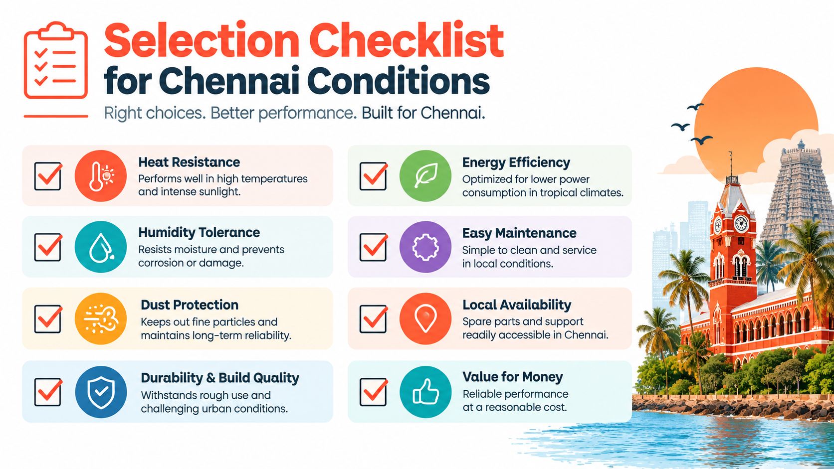
Take this checklist to the showroom and the site. Don't approve a tile from a small sample alone, and don't accept a product only because its catalogue calls it “premium”.
Start with the standard
Ask whether the product is documented under IS 15622 and request the manufacturer's technical information. For a floor tile, check water absorption, breaking strength, surface abrasion classification and dimensional consistency. The IS 15622 framework distinguishes vitrified and ceramic groups, so the product classification should be clear.
Fully vitrified BIa tiles at 0.5% or lower absorption are commonly recommended for heavy-traffic floors and wet areas in Indian tile guidance, as described by this bathroom tile standards guide. A commonly cited market figure for vitrified bodies is around 0.05% water absorption, but treat the actual manufacturer's test report as more important than a generic catalogue claim, as outlined by Tiles Finders' GVT information.
Use finish rules, not showroom lighting
Dry rooms: Polished works for living and dining floors where the design effect matters.
Kitchens: Choose matte or satin for a more forgiving daily surface.
Bathrooms and balconies: Specify an anti-skid product, with R10 or higher only when the manufacturer documents that rating for the product.
Lapatto: Treat it as a visual compromise, not a wet-zone guarantee.
Shade variation: Check the manufacturer's V rating so you know whether boxes will look uniform or intentionally varied.
For thickness, 8 to 10 mm generally suits apartment floors when the substrate is sound. Villas, driveways and heavier applications may justify 12 mm or more, but the installation system and load conditions still matter.
Test the Chennai reality
Take a sample outdoors or near a bright window and inspect the colour. Ask about hot-sun fade testing if the tile will sit on an open balcony. Pour a small amount of water on a sample with the supplier's permission and assess the grip, but don't treat a showroom test as a formal slip rating.
Finally, read the builder's handover specification. If the apartment already includes a suitable vitrified floor, replacing it with digital GVT may add cost without improving daily performance. For larger upgrade decisions, this home renovation guide for Chennai can help you organise the work around actual site conditions.
Installation, Cleaning, and Long-Term Maintenance
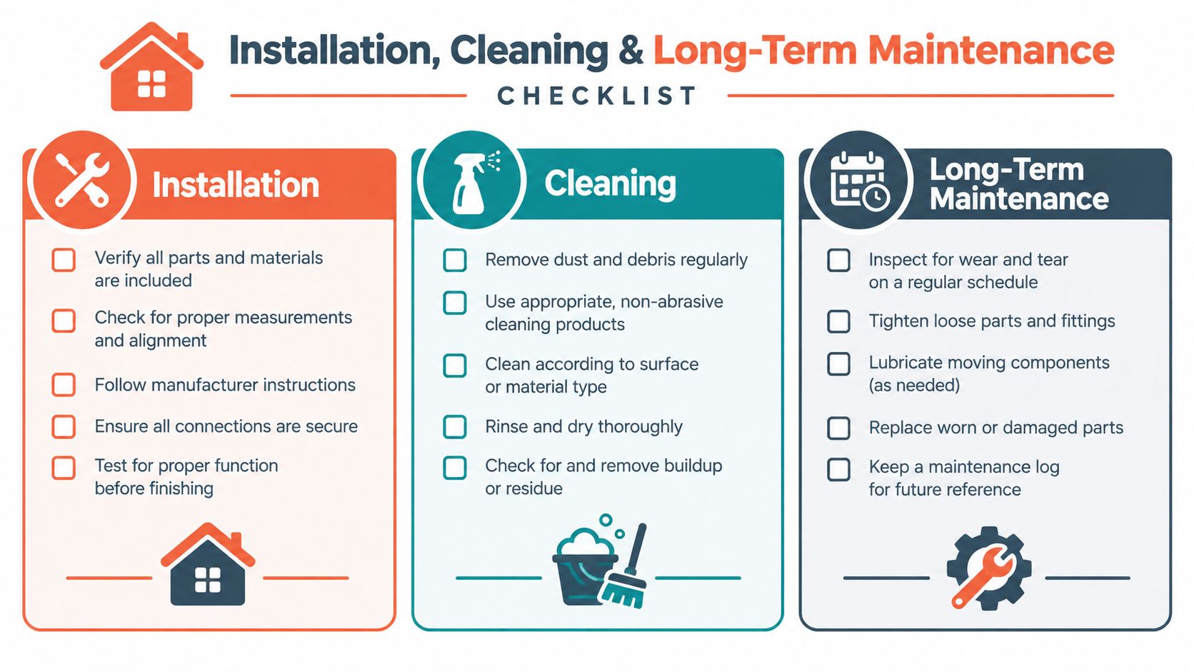
A good digital GVT can still fail visually when the installer works on an uneven base or uses the wrong bedding method. RCC floors and older apartment screeds often have slight undulation, so the installer should check flatness before ordering large-format tiles.
Use a suitable tile adhesive and the correct notch trowel rather than relying on dry mortar alone. For 600 x 600 mm tiles, a 1.5 to 2 mm spacer can create a controlled joint when the product and substrate allow it. Check the manufacturer's recommendation, align the layout from the room's most visible axis, and allow at least 24 hours before grouting where the adhesive system requires that curing period.
Prevent the installation defects people notice first
Lipping between adjacent tiles catches light and becomes obvious across a polished floor. Inadequate adhesive transfer at corners creates hollow spots and weak edges, especially where heavy furniture later moves across the surface.
Ask the installer to check:
Substrate flatness: Correct dips before fixing the tiles.
Adhesive coverage: Pay special attention to corners and large-format pieces.
Layout alignment: Dry-lay visible areas before permanent fixing.
Cut edges: Keep exposed cuts away from prominent doorways and thresholds.
Clean without attacking the glaze
Daily dust removal and warm water are usually enough for routine care. Use a neutral-pH cleaner when needed. Acidic products and strong bleach can dull the finish, discolour grout or damage surrounding metal fittings over time.
Cement grout benefits from sealing, while epoxy grout is a sensible choice for bathroom and kitchen joints exposed to Chennai humidity, soap residue and cooking splashes. For a separate explanation of when sealing is needed, consult Flacks Flooring sealing advice. Refresh any required grout sealant according to the product instructions, with many maintenance schedules placing this at 12 to 18 months.
Wet-zone safety still comes first. Choose an anti-skid series rather than assuming every matte finish is safe, and place bath mats near showers without allowing moisture to remain trapped beneath them. If a chip exposes the white vitrified body, a compatible touch-up glaze pen can reduce the contrast, while corner guards on balcony edges help prevent impact damage from planters, buckets and moved furniture. More ideas for selecting durable finishes are available in this guide to low-maintenance interior materials.
When Digital GVT Is Worth It and When It Is Overkill
Digital GVT is worth the money when the room is visible, used often and central to the home's appearance. Living rooms, dining areas, feature walls and carefully selected balconies can benefit from its realistic print, broad pattern range and easy-clean surface. In a builder-grade Chennai apartment, replacing a dull visible floor with a well-chosen GVT can lift the handover appearance without moving to imported marble.
It becomes overkill when the room has little visual importance or the surface faces unusually harsh impact. Store rooms, utility corners and many bedroom floors don't need expensive digital patterning. A pooja room with heavy brass furniture also deserves caution because dragging or dropping metal objects can damage a glazed surface. Rental units need a separate calculation, since a tenant turnover may not justify a design-led finish.
Use this decision rule
High visibility and frequent cleaning: Choose digital GVT when the visual upgrade matters.
Impact and abrasion dominate: Choose full-body or double charge vitrified tile.
Traffic is low and budget is tight: Choose ceramic where its use is technically suitable.
Wet conditions are constant: Choose a documented anti-skid product, not a polished surface.
The builder's existing tile is adequate: Spend the upgrade budget on lighting, storage or installation quality instead.
The Indian tile market has expanded from about ₹360 billion in FY2019 to ₹531 billion in FY2025 and is projected to reach ₹769 billion by FY2029, while glazed vitrified tiles represented 35.5% of industry revenue in FY2025, according to the Varmora Granito market information on Moneycontrol. That premiumisation is real, but the buyer still needs discipline. Digital GVT is a design choice, not a status upgrade.
Interiors by DeX plans, manufactures and executes Chennai home interiors, including finish selection, space planning, modular kitchens, storage and site handover. If you're choosing digital GVT for a new flat, villa or renovation, visit Interiors by DeX to discuss the right tile, layout and supporting finishes for your home.