
You choose a soft greige from a shade card, approve it in the paint shop, and feel confident. Once the painter finishes your Chennai bedroom, the walls look yellow under the evening LED, grey beside the wardrobe, and oddly pale near the window. The colour wasn't necessarily wrong. You judged it in the wrong light and without the rest of the room.
Bedroom putty colour needs more than a shade-card decision. You need to define the neutral family, check daylight and lamp colour, compare fixed finishes, test the full putty-primer-paint system, and rule out moisture before committing. Even bedroom details such as a wallpaper feature wall benefit from careful preparation, so these expert wallpaper application tips are useful when you're planning a contrasting surface.
Why Your Bedroom Putty Colour Keeps Looking Wrong
The most common mistake happens before the first brush touches the wall. A homeowner selects a warm neutral under bright retail lighting, then expects the same shade to behave identically in a compact bedroom with limited daylight, a large laminate wardrobe and warm bedside bulbs.
It won't. The same putty colour can look yellow in warm LED light, grey in a shadowed corner and cleaner beside white furniture than beside teak. The wall also changes as the coating dries, because the whiteness and porosity of the putty affect how the primer and colour coat are perceived.
The shop sample is not your bedroom
A small card gives you a colour reference, not a room result. It doesn't show how the shade will sit against your flooring, curtains, bed upholstery, false ceiling or wardrobe doors. It also can't reveal whether the wall absorbs primer unevenly or whether repaired areas will flash after painting.
Chennai apartments create an especially demanding test. Bedrooms may combine a narrow window, reflected daylight, artificial lighting and substantial built-in storage on several walls. In villas, wood finishes and larger wall planes create a different balance, so a shade that works in a flat may feel too light or too cold in a bigger room.
The practical rule: Never approve a putty colour from a small card alone. Approve the dried coating system on the actual wall.
This guide gives you a straightforward way to choose a shade family, understand changing light, coordinate fixed materials, test a proper sample and prevent dampness from ruining a beautiful finish. Start with the wall and the room you have, not the lighting in the showroom.
What Bedroom Putty Colour Actually Means
Putty colour isn't one standardised shade in India. It's better understood as a warm neutral family that includes beige, taupe, greige, sand, almond and soft cream. Some versions lean yellow or brown, while others sit closer to pale grey or stone.
Indian homeowners favour these tones for practical reasons. They warm a room without the starkness of pure white, coordinate naturally with timber and upholstered furniture, and can disguise everyday dust better than very light white surfaces. That makes them particularly useful in bedrooms with teak wardrobes, wood-look flooring and layered fabrics.

Use recognised families, not vague names
Indian Standards don't define “putty colour” as one universal bedroom shade. IS 5:2007 classifies 104 ready-mixed paint and enamel colours into groups including cream and buff, brown and pink, grey, green, yellow and other colour families (BIS colour classification). That means two manufacturers can use the word putty for visibly different products.
The related IS 3537:1966 reference includes names such as Pale Cream, Deep Cream, Light Buff, Middle Buff, Deep Buff, Light Stone, Dark Stone, Portland Stone, Beige, Silver Grey, Light Grey and White (interior paint colour references). These names help you narrow the direction, but they still don't replace a physical sample.
Whiting used in paint and putty also has material requirements covering colour, opacity, water demand and particle size. IS 63:2006 distinguishes Grade 1 amorphous material, suitable for making putty and paints, from Grade 2 crystalline material intended for other uses (whiting requirements for paint and putty). The visible result depends on the material beneath the colour as well as the pigment above it.
Write down the exact manufacturer shade, product, finish and approved sample. “Bedroom putty colour” is a useful design direction, but it isn't a complete specification.
How Lighting and Room Size Change the Same Shade
Lighting changes the perceived undertone before you change the paint. A warm LED can pull a beige or almond shade towards yellow. A shadowed wall can make the same surface look grey, while daylight may reveal a softer cream or stone character.
Start with the window. Note whether direct morning light reaches the wall, whether the room receives a weaker reflected light later in the day, and which corners remain shaded. A bedroom with one limited opening needs more careful testing than a room with broad daylight on several sides.
Compare the room's light sources
Warm-white lamps make warm putty families feel richer, but they can also make a yellow-based shade feel heavy. Neutral-white lighting usually gives a more balanced reading. Cool-white light can push beige towards grey and make a warm bedroom feel less inviting.
Compact bedrooms amplify these changes because the wall surface sits close to the bed, wardrobe and light sources. A broad wall in a villa may absorb the effect more gently, while a small flat bedroom can make every undertone obvious. Check the wall against the actual LED fittings, not a phone photograph taken with automatic colour correction.

Lighter isn't automatically better
Lighter, receding colours such as off-white, pale grey and light blue are commonly used to make urban rooms appear more spacious. They reflect more light visually and can reduce the sense that the walls are closing in.
That doesn't mean every Chennai bedroom should be pale. Beige and earthy neutrals work well in independent homes with wood because they complement timber and handle everyday dust more forgivingly than very light white. Familiarity also influences decisions. 2025 purchase data reported lighter shade preferences in southern India, while nearly 50% of consumers repeatedly chose the same 20 trusted shades (reported shade preference context). The useful conclusion isn't to chase a trend. Choose a shade your fixed materials and lighting can support.
For a calmer sleep environment, coordinate the wall with the room's visual and practical elements, including the bed, curtains and bedside lighting. Advice on creating a restful sleep oasis is helpful here, because colour should support the way the room is used rather than operate as an isolated decoration. Also review your bedroom ceiling light ideas before finalising the wall colour.
Matching Putty Walls With Your Wardrobe and Furniture
Your wardrobe is often the largest fixed colour block in the bedroom. Treat it like a second wall, not a piece of furniture you can ignore. A putty shade that looks elegant on a sample can become muddy beside yellow teak, cold beside blue-grey laminate or too flat against a pale floor.
Take physical samples of the wardrobe laminate, flooring, curtain, bed upholstery and false-ceiling tone. Place the proposed putty sample beside each one in daylight, then repeat the check with the bedroom lamps switched on. You're looking for a shared undertone, not an exact colour match.
Build a shortlist around fixed materials
Use this comparison as a starting point, then confirm every pairing on your actual wall.
Shade family | Best paired with | Room mood |
|---|---|---|
Warm beige or almond | Teak wardrobes, honey-toned wood, cream upholstery | Comfortable and traditional |
Soft greige | White modular units, neutral curtains, pale oak or balanced flooring | Quiet and contemporary |
Light stone or sand | Mid-tone wood, woven textures, muted fabrics | Grounded and relaxed |
Pale cream | White storage, warm ceiling tones, light bedding | Bright but softer than pure white |
Taupe or mushroom | Grey laminates, upholstered beds, warm metal accents | Enveloping and refined |
Soft cream-grey | Mixed wood and grey finishes, patterned curtains | Adaptable and layered |
A warm neutral supports both minimal contemporary interiors and traditional teak-based schemes. That flexibility makes it a strong base for a new flat where wardrobes, lighting and storage still need to be coordinated.
Add contrast without shrinking the room
You don't need a bold feature wall to create depth. A darker headboard wall or muted accent colour can anchor the bed while the remaining walls stay in a lighter putty family. Keep the undertone related, otherwise the contrast will look accidental.
If the wardrobe is dark, avoid choosing a wall at the same visual depth. Give the storage enough separation so its edges remain clear. For detailed planning around storage proportions, material choices and hardware, review this guide to custom-built wardrobes.
Finish with two or three realistic candidates, not a long list. If one works with the wardrobe but fights the floor, remove it. The best bedroom colour is the one that makes the entire room look intentional.
Testing Samples the Right Way Before You Commit
A bedroom sample must show the finished wall, not just a shade card. Prepare a roughly 1 m² mock-up on the actual bedroom wall with the genuine putty, compatible primer and selected topcoat. Use the same putty-primer-paint system planned for the room, because the substrate can change absorption, colour depth and sheen.
Inspect the surface before applying anything. Remove dust, grease, loose particles and friable plaster, then lightly pre-wet the wall. Apply cement-based polymeric putty in two thin crossed coats. A government substrate specification calls for approximately 40 to 50% clean potable water, about four hours of drying after the first coat and sanding after the second coat has dried for three days. Keep the mock-up away from an uneven patch, or the sample will test wall defects rather than colour.
Judge the sample across the whole day
Chennai daylight can make the same putty colour appear crisp in the morning, pale and flat in strong afternoon light, then warmer under evening LEDs. Inspect the mock-up in morning, afternoon, evening and night lighting. View it from the bed and doorway, then check it under 45-degree raking light. Phone images are unreliable because automatic exposure and white balance conceal these shifts.
Check the finish closely:
Uniform sheen: Dull and glossy zones should not alternate across the wall.
No flashing: Repaired areas must reflect light like the surrounding surface after drying.
No lap marks: Overlapping roller or brush passes should disappear.
Consistent corners: The shade should remain convincing where walls meet and light falls away.

For texture, sheen or surface character, compare the finish with a guide to texture paint in living rooms, then choose only what suits the bedroom's fixed finishes.
Approve the coating, not only the hue
Assess the complete system: substrate preparation, two putty coats, compatible primer and two finish coats. Indian interior painting application guidance recommends a first putty coat of about 1 to 1.5 mm, a second coat of about 0.5 to 1 mm, light sanding with approximately 120-grit abrasive, and at least 4 to 6 hours of drying between coats before priming.
Mix only what can be used within 45 to 60 minutes. Adding water to stiffened putty can change consistency and weaken adhesion. Choose a low- or mid-sheen interior emulsion for easier cleaning. High sheen exposes undulations, pinholes and trowel ridges.
Approve the sample only when the colour, finish, lighting and fixed wardrobe or flooring work together.
When a Beautiful Colour Still Fails
A pale putty shade cannot rescue a damp wall. In coastal-city homes, moisture rather than colour fade is a common cause of interior paint failure, and seepage, condensation or poor ventilation can make a correctly chosen colour blister, chalk or detach (coastal paint and indoor-air guidance).
Check the wall before you approve the shade. Look for external seepage, plumbing leaks, salt deposits, peeling paint and condensation behind a wardrobe. Don't seal visibly damp masonry with putty. Fix the water source, allow the substrate to dry and record wall moisture before the coating work starts.
The bedroom needs an air-quality decision
Fresh paint and associated finishes can release volatile organic compounds, or VOCs. Indoor pollutant concentrations can exceed outdoor levels, so a bedroom deserves more than a fashionable colour name. Choose a declared low-VOC or zero-VOC water-based system where suitable, and provide substantial ventilation during application and drying.
Ask the painter or supplier for the product data, not a verbal promise. Confirm that the putty, primer and topcoat are compatible, and follow the coating manufacturer's ventilation and re-entry guidance. Don't sleep in the room while strong odour remains or before the stated drying and ventilation requirements have been met.
A dry substrate and compatible coating system matter more than whether the final shade is beige, greige or cream.
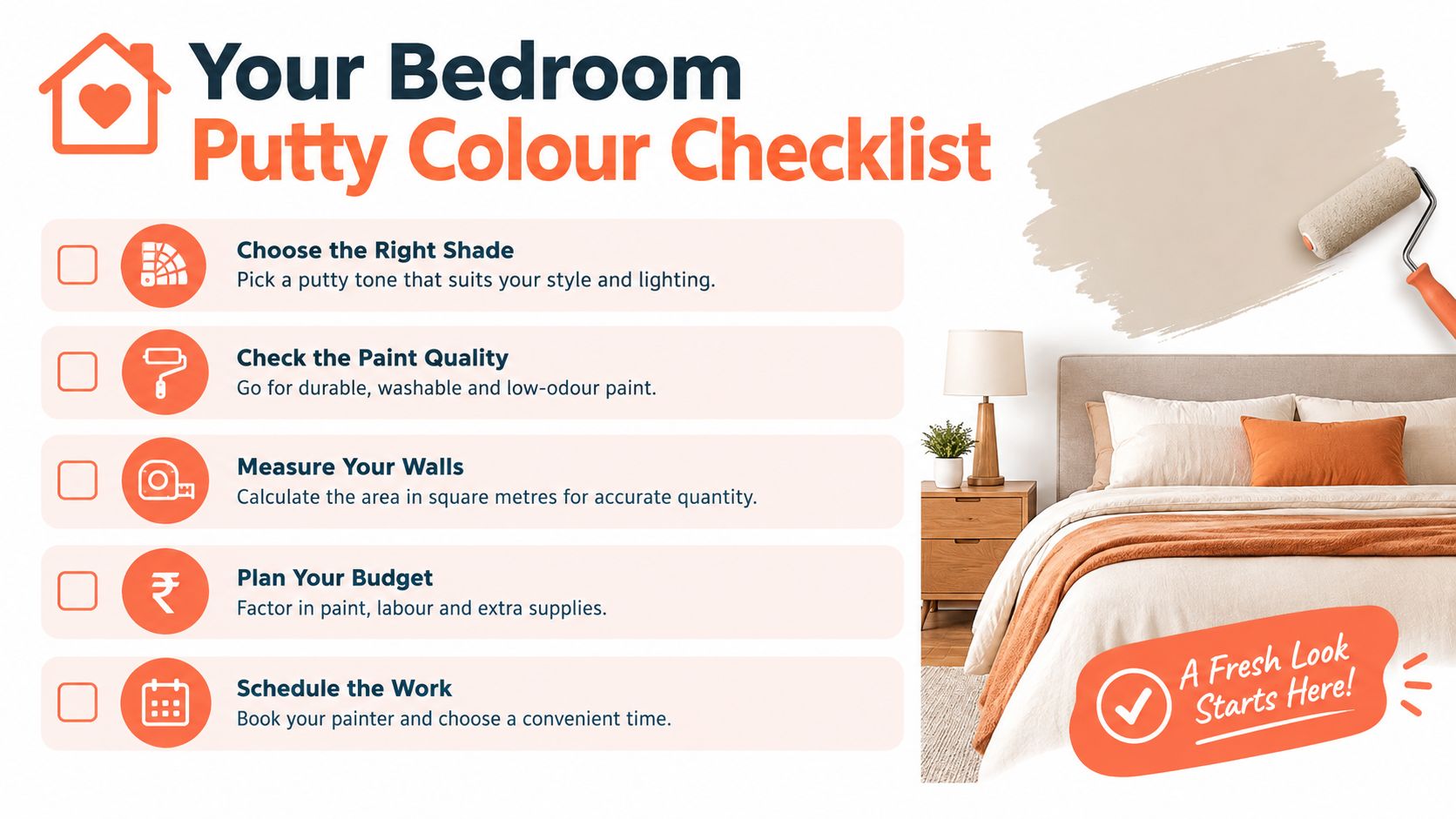
Your Bedroom Putty Colour Checklist
Use this list before the painter starts:
Define the shade precisely. Choose a physical manufacturer sample or recognised reference, and write down the exact shade rather than using “putty” alone.
Record the light. Note the window direction, shaded corners and the lamp colour used at night. Check warm-white, neutral-white or cool-white effects on the actual wall.
Compare fixed finishes. Place the candidate beside the wardrobe laminate, flooring, curtains, bed upholstery and false-ceiling tone.
Run the full test patch. Use the actual putty, primer and topcoat on roughly 1 m², then inspect it in morning, afternoon, evening and night lighting.
Approve the surface. Reject pinholes, powdering, trowel ridges, visible joint lines, flashing and lap marks before the primer goes on.
Check moisture first. Verify that the wall is dry, investigate condensation behind wardrobes and correct seepage or plumbing leaks.
Confirm compatibility. Specify the complete putty-primer-paint system and retain the product details for future touch-ups.
Choose the sheen deliberately. Low- or mid-sheen emulsion is usually the sensible bedroom choice. Avoid excessive sheen on uneven masonry.
Record the final decision. Keep the approved shade, finish, sample and application sequence in writing.
The mistakes are equally clear. Don't choose from a tiny card, skip the primer check, paint over damp masonry or trust a phone photograph. Don't assume a lighter wall will automatically make a compact room better, especially if it clashes with cold flooring or a grey wardrobe.
A coordinated design team becomes valuable when the bedroom is part of a new flat, villa or renovation and the wall colour must work with wardrobes, lighting, flooring and storage at the same time. You'll avoid expensive shade changes when one team owns the finish schedule and checks the room as a complete interior.
Interiors by DeX plans, manufactures and executes Chennai home interiors, including bedroom layouts, wardrobes, lighting coordination, painting support and finish selection. If you want your bedroom putty colour tested against the actual storage and material palette before site execution, visit Interiors by DeX to discuss your project.