
A Chennai flat can have good bones, useful rooms, and sensible furniture, yet still feel unfinished because the walls are tired, plain, or marked by daily life. A full renovation may not fit the budget, but paint can change the mood of a room without moving a wall, replacing a floor, or rebuilding storage.
These ten painting walls ideas cover practical changes for compact apartments, larger villas, and homes that mix traditional details with modern furniture. You'll find simple accent walls, calm monochromatic palettes, geometric blocks, ombre effects, limewash, Venetian plaster, painted wainscot, stencils, cultural murals, and functional chalkboard zones. Each idea includes the condition that makes it work, the problem that can make it fail, and a realistic DIY or professional route.
Start by looking at the room in morning and evening light. A shade that looks balanced beside a sample board may appear too cold near a north-facing window or too strong beside warm artificial lighting. For wider colour inspiration, compare your choices with these best interior paint shades for Atlanta, then test every shortlisted colour on your own Chennai wall.
1. Accent Feature Wall
An accent wall gives you the strongest visual change with less paint and less risk than covering the whole room in a deep shade. In a Chennai apartment, it works especially well when wall space is limited and one surface needs to create a clear focal point.
Use a deep blue or green behind the bed, with light grey on the other walls. In a living room, a warm mustard or clay tone can frame the television while the sofa wall remains off-white. The wall should be visible as you enter the room, or it should receive enough natural light to show the colour clearly.
Make the bold wall look intentional
Match the accent shade with upholstery, rugs, curtains, wooden furniture, or modular finishes. A mustard wall beside cool blue seating may look disconnected, while a clay wall can work naturally with teak, cane, beige, and terracotta accessories.
Paint a sample directly on the wall. Check it in morning and evening light before buying the full quantity. For a busy living room or passage, choose a washable, water-based emulsion with documented VOC information rather than relying only on an “eco-friendly” label. A practical specification includes the product code, sheen, number of coats, and substrate preparation method.
DIY works when the wall is sound and already smooth. Hire a painter when there are cracks, old patches, damp marks, or uneven colour, because a strong shade exposes preparation defects quickly.

Practical rule: An accent wall should support the room's furniture, not compete with every object in it.
2. Monochromatic Colour Scheme
A monochromatic room uses one colour family in different shades across the walls, ceiling, trim, wardrobe, and soft furnishings. The result feels calmer than a room with several unrelated colours, which makes it useful in compact Chennai flats with limited daylight or busy storage walls.
Try three tones of warm beige. Use a pale wall shade, a deeper taupe on a trim or niche, and caramel through cushions or a chair. A bedroom can use soft sage green on the walls, a lighter ceiling, and a slightly deeper wardrobe finish. The palette stays quiet, but the changes in tone prevent it from feeling bland.
Control undertones before painting
Choose one base colour and build a palette of three or four related tones. Check whether each shade is warm or cool before approving the full set. Warm lighting can make beige look yellow, while a cool grey may feel harsh beside warm wood and cream upholstery.
Use a lighter ceiling to lift a low or compact room. Matte walls with eggshell furniture details can add depth without introducing another colour. If your room has putty repairs or patched surfaces, smooth and prime them first. More guidance on coordinating bedroom surfaces appears in this bedroom putty colour guide.
DIY suits a simple wall and ceiling palette. A professional painter is a better choice when several tones meet at corners, around wardrobes, or across built-in units. One uneven cut line can make a restrained monochromatic scheme look careless.
3. Colour Blocking
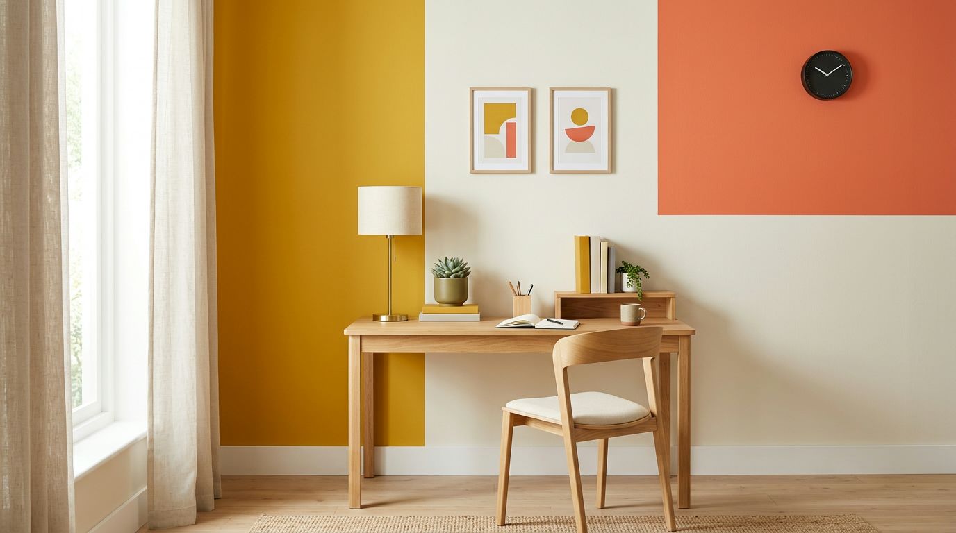
Colour blocking turns a plain wall into a graphic composition. It suits a study, children's room, reading corner, or entertainment wall where a modern identity matters more than a soft, uniform background.
A study can use deep charcoal below and soft white above, separated by a clean horizontal line. In a child's room, vertical mustard, coral, and cream stripes can sit on one wall while the remaining surfaces stay quiet. The method works in compact homes because the design is concentrated rather than spread across every wall.
Measure before opening the paint tins
Mark the layout with a level and chalk line. Align the edges with a window, door frame, desk, bed, or storage unit so the blocks look connected to the architecture. Limit the palette to two or three colours. Too many sections can make a small room feel restless.
Paint the lighter colour first and let it dry fully. Apply painter's tape over the dry surface, then paint the darker block. Remove the tape while the second colour is slightly tacky, not after it has fully hardened. This helps reduce peeling and gives the edge a cleaner finish.
DIY is suitable for straight blocks and simple stripes. A professional should handle angled shapes, repeated bands, or walls with uneven plaster. Colour blocking won't hide a damp patch, bulging plaster, or a badly repaired crack. Fix the wall first, then mark the pattern.

4. Ombre and Gradient Wall
An ombre wall shifts gradually from one shade to another. It gives a bedroom, staircase, or reading corner a soft artistic quality without the cost of a complete mural. The effect is most successful when the colour transition feels deliberate rather than patchy.
A bedroom could move from pale blush near the top to deeper terracotta near the floor. A staircase wall could shift from white to soft grey along the flight. In both cases, related shades are easier to blend than colours that sit far apart on the colour wheel.
Blend while the surface is wet
Use two or three nearby shades. Prime the wall well so each section absorbs paint evenly. Divide the wall into workable bands, apply the colours, and blend the meeting areas with overlapping strokes before the paint dries. Work quickly, but don't rush the preparation.
Test the transition on a large board first. Small colour cards won't show whether the blend looks smooth from across the room. Check the board beside the flooring, curtains, and artificial lights you already use.
A confident DIY painter can attempt a small bedroom wall with a helper mixing and loading paint. Hire an experienced applicator for a tall staircase or a wide feature wall, because pauses create visible bands. An ombre effect also fails when the base wall is damp, rough, or unevenly primed.
5. Limewash Finish
Limewash gives walls a breathable, matte, mineral appearance with soft variations in tone. It suits Chennai villas, heritage-inspired homes, and living rooms where a warm white or earthy finish should feel less uniform than ordinary emulsion.
The finish can work well in humid conditions when the wall is dry, stable, and prepared correctly. It won't solve seepage, plumbing leaks, rising damp, or active mould. Painting over a wet wall only hides the problem briefly and may trap contamination beneath the new surface.
Treat preparation as part of the finish
Remove loose material, efflorescence, and old gloss paint before application. Apply two or three thin coats instead of one heavy coat. In kitchens or other high-moisture zones, ask whether a suitable breathable topcoat is appropriate for the specific system.
A sample panel matters because limewash changes with brush direction, wall texture, and light. The finish may look soft and cloudy on a broad wall but too uneven beside polished furniture. Review it beside the actual floor, woodwork, and lighting.
DIY is possible for a small dry feature wall if you understand the product and accept natural variation. A professional applicator is safer for a full living room, villa staircase, or heritage-style interior. Review compatible wall finishing materials before selecting a system.
Limewash is a finish, not a waterproofing treatment. Repair moisture first.
6. Venetian Plaster Effect Paint
Venetian plaster effect paint imitates the polished, marble-like appearance of traditional plaster. Modern paint-based and microcement-style products can create a refined surface with a gentle sheen, making them suitable for a Chennai villa foyer, master bedroom, or premium apartment feature wall.
A pale stone finish can give an entrance foyer a quiet luxury. Warm greige with a subtle metallic highlight can work behind a bed, but it needs controlled lighting and restrained furniture. Grazing light will reveal the texture, including uneven trowel marks, so the substrate must be smooth.
Plan the finish around light
Fill dents, level patches, and apply the correct primer before starting. Ask for a sample panel and examine it under the actual ceiling lights, daylight, and wall sconces. A finish that looks elegant in a showroom may look too shiny beside cool LED lighting.
Use a protective sealer where the product requires one, especially in rooms exposed to humidity. Avoid using the effect on every wall in a compact flat. One foyer or bedroom wall usually gives the finish enough presence without making the room feel heavy.
DIY is risky unless the product is designed for simple roller application. Burnishing, layering, and polishing require practice. A professional finish is justified when the wall will sit beside expensive furniture or become the first surface visitors see. Compare application methods through this texture paint guide for living rooms.
7. Two-Tone Wainscot and Board-and-Batten Look
Painted wainscot creates architectural character without requiring a full renovation. The lower section can be darker and easier to clean, while the upper wall stays lighter. This works in dining rooms, hallways, living rooms, and apartment passages where additional furniture would take up too much floor space.
Try a deep green lower section with a soft cream upper wall in a dining area. In a hallway, painted board-and-batten strips in greige can add rhythm while the surrounding wall remains a lighter neutral. The lower tone should relate to nearby kitchen cabinets, wardrobes, flooring, or door finishes.
Keep the horizontal line believable
Set the dividing line in relation to furniture backs or seating height. If it floats awkwardly above the sofa or cuts through a window handle, the room will look poorly planned. Measure every panel and keep the spacing consistent. Uneven battens are more noticeable than a plain wall.
Use satin or semi-gloss on the lower section if the wall receives fingerprints, shoe marks, or chair contact. Keep the upper portion in a lower-sheen finish to reduce glare. On a rental or low-budget project, paint can suggest the wainscot line without installing heavy trim.
DIY works for a painted two-tone wall with a simple horizontal division. Hire a carpenter and painter when real battens, corner returns, or door casings are involved. The idea fails when the lower zone is too dark for a narrow passage or when the pattern doesn't align with existing furniture.
8. Geometric Stencil and Trompe l'Oeil Pattern
Stencils add pattern without the cost or permanence of full wallpaper. Trompe l'oeil painting goes further by creating the appearance of arches, shelves, columns, or other architectural details on a flat wall. Both methods suit an alcove, powder room, children's room, or one living room niche.
A soft blue and white hexagon stencil can suggest tile in a powder room. A neutral painted bookshelf can give a living room alcove character without adding depth or reducing floor space. Geometric patterns can also echo the shapes used in geometric canvas wall art, especially when the artwork and wall share two colours.
Start with a small pattern
Draw the layout on paper first. Transfer the design with a level, light pencil marks, and low-tack tape. Keep the pattern on one feature wall or inside one alcove. A full-room stencil can overwhelm compact Chennai interiors, especially when the room already has patterned upholstery or busy tile.
Use a low-sheen finish. High gloss highlights brush marks and makes small alignment errors more visible. Load the stencil brush lightly, dab off excess paint, and build the colour in thin layers.
DIY suits repeated simple shapes. Complex arches, realistic shelves, or perspective work needs a muralist. A professional can also correct walls that aren't square, which matters when a geometric design runs close to a door or window.
9. Traditional Hand-Painted Murals
A hand-painted mural can give a Chennai home a sense of place that standard colour combinations can't provide. Tanjore painting from Thanjavur, Kerala mural art, and Madhubani art from Bihar offer distinct visual traditions. A mural inspired by Tamil or South Indian themes can anchor a puja room, entrance foyer, or living room.
A deity panel in a puja room may suit a traditional South Indian home with carved wood and brass details. A nature and mythology scene can work in a Kerala-style foyer, while a simplified botanical or folk border may suit a modern apartment better than a detailed full-wall composition.
Approve the artwork before the first brushstroke
Ask the artist for a scaled drawing and colour sample. Review the design beside the room's furniture, flooring, and lighting. The mural should support the architecture and function of the room, not make a narrow passage feel crowded.
Protect the finished work with a suitable UV-resistant varnish where the product and artist recommend it. Keep the mural away from direct sunlight and high humidity where possible. Avoid placing it on a wall with seepage, condensation, or recurring mould.
DIY is reasonable for a simple border or stylised botanical design. A traditional figure, detailed mythology panel, or perspective scene deserves an experienced artist. The cost depends on preparation, scale, detail, and protection, so approve the design and scope before work begins.
10. Chalkboard and Magnetic Paint Zones
A chalkboard or magnetic zone turns part of a wall into a useful household surface. It can hold children's drawings, school reminders, grocery lists, weekly menus, or family notes. In Chennai apartments, the best location is usually a study wall, kitchen side panel, pantry, or family command centre.
A child's study can have a chalkboard panel beside the desk and a magnetic strip for displaying artwork. A kitchen can combine a magnetic grocery-list area with a chalkboard menu. Keep the zone defined, rather than coating an entire wall and making the room feel like a classroom.
Prepare for daily use
Season chalkboard paint before writing by rubbing the side of a chalk stick over the surface, then wiping it clean. This reduces ghosting. Magnetic paint needs a dedicated primer or system to improve adhesion and performance. Test the magnets you plan to use, because decorative magnets may not hold papers well.
Frame the zone with painted trim that matches the modular study, kitchen cabinets, or nearby wardrobe. A satin border can make the functional panel look intentional. Avoid placing it where cooking steam, sink splashes, or constant dampness will shorten the finish's life.
DIY works for a small rectangular panel with straight edges. A professional can create a built-in command centre around shelves, lighting, sockets, and storage. The idea fails when the surface is too close to a wet counter or when there isn't enough light to read the notes.
10 Wall Painting Ideas: Quick Comparison
Item | Implementation Complexity (🔄) | Resource Requirements (⚡) | Expected Outcomes (📊) | Ideal Use Cases | Key Advantages (⭐ / 💡) |
|---|---|---|---|---|---|
Accent Feature Wall | 🔄 Low, single-wall prep and paint | ⚡ Low, standard paints, rollers, minimal labour | 📊 Clear focal point; adds depth, ⭐⭐⭐ | Living rooms, bedrooms, compact Chennai apartments | ⭐ Low cost; easy to change. 💡 Test samples in different light. |
Monochromatic Colour Scheme | 🔄 Moderate, careful tonal planning | ⚡ Moderate, multiple shades, quality finishes | 📊 Calm, seamless, visually larger, ⭐⭐⭐ | Small or low-light rooms; connected living/dining areas | ⭐ Easy coordination; sophisticated. 💡 Use textures and confirm undertones. |
Colour Blocking | 🔄 Moderate–High, precise layout and taping | ⚡ Moderate, painter's tape, 2–3 paints, steady application | 📊 Bold, modern graphic statement, ⭐⭐⭐ | Kids' rooms, home offices, zoning open plans | ⭐ Customisable zones. 💡 Limit palette to 2–3 colours; tape carefully. |
Ombre and Gradient Wall | 🔄 High, skillful blending required | ⚡ Moderate, several shades, blending tools, time | 📊 Soft, artistic movement; can change perceived height, ⭐⭐⭐ | Bedrooms, reading corners, feature areas | ⭐ Distinctive finish. 💡 Blend while paint is wet; trial on sample board. |
Limewash Finish | 🔄 High, layered application and prep | ⚡ Moderate–High, lime products, suitable substrate, skilled applicator | 📊 Matte, mottled, breathable finish suited to humidity, ⭐⭐⭐⭐ | Villa living rooms, heritage cafés, humid coastal homes | ⭐ Breathable and natural. 💡 Confirm substrate is dry and compatible. |
Venetian Plaster Effect Paint | 🔄 Very High, multi-layer trowel & burnish | ⚡ High, specialised materials, experienced craftsmen, sealer | 📊 Polished, stone‑like luxury finish, ⭐⭐⭐⭐ | Premium foyers, master bedrooms, high-end residences | ⭐ High-impact, durable when sealed. 💡 Request sample panel; seal for humidity. |
Two‑Tone Wainscot / Board‑and‑Batten | 🔄 Moderate, precise measuring and trim work | ⚡ Moderate, battens/mouldings, paints, basic carpentry | 📊 Adds architectural proportion and protection, ⭐⭐⭐ | Hallways, dining rooms, apartments needing detail | ⭐ Architectural character with minimal build. 💡 Set dividing line to match furniture heights. |
Geometric Stencil & Trompe l'Oeil | 🔄 High, time-consuming, alignment sensitive | ⚡ Moderate, stencils/masks, paints, possible muralist | 📊 Custom patterns or illusions; handcrafted impact, ⭐⭐⭐ | Alcoves, powder rooms, feature walls | ⭐ Highly customisable; cheaper than custom mouldings. 💡 Plan layout and limit coverage. |
Traditional Hand‑Painted Murals | 🔄 Very High, artisanal, long timelines | ⚡ High, skilled artists, pigments, possible gold leaf | 📊 Distinctive cultural focal point; high artistic value, ⭐⭐⭐⭐ | Puja rooms, entrance foyers, culturally themed homes | ⭐ Bespoke cultural artistry. 💡 Get scaled designs and protect with UV varnish. |
Chalkboard & Magnetic Paint Zones | 🔄 Low, straightforward application | ⚡ Low, specialised paints, primer, magnets/chalk | 📊 Functional writable/magnetic surface; practical utility, ⭐⭐⭐ | Kitchens, kids' studies, family command centres | ⭐ Functional and low-cost. 💡 Season chalkboard paint; limit zone size. |
Choose One Wall, Test It Well, Then Expand
The best painting walls ideas usually start with one wall, one alcove, or one practical zone. You don't need to commit the entire flat to a new colour or decorative finish before seeing how it behaves in real Chennai light and humidity.
Paint two or three samples on the actual surface. Place them where furniture, curtains, flooring, and artificial lights will surround them. Check the samples in the morning and evening. A pale green may feel fresh beside daylight but grey beside a cool ceiling light. A warm beige may look calm in one room and yellow beside certain wood finishes.
Match the finish to the room's use. Bedrooms and living rooms benefit from washable water-based emulsions where cleaning matters. Kitchens and utility areas need products selected for moisture and cleaning conditions. A decorative coating cannot repair seepage, active dampness, plumbing leaks, or mould. Inspect the wall first, improve ventilation, and complete repairs before painting.
Product selection should be specific. Ask for the technical data sheet and record the declared VOC value in grams per litre, lead compliance, sheen, product code, coverage assumption, number of coats, and preparation method. Common benchmarks describe products below approximately 50 g/L as low-VOC and below approximately 5 g/L as zero- or near-zero-VOC, while India's decorative-paint framework limits lead in household and decorative paints to 90 ppm. These specifications are especially useful for children's rooms, occupied homes, and fast handovers, as explained in this low-VOC paint guidance for healthy indoor air.
Ventilate freshly painted rooms through cross-ventilation for several days. Don't sleep in a freshly painted room just because the smell has faded. Low odour and low emissions aren't identical, so ask the supplier for documented product information rather than relying on “odourless” or “green” labels. This matters in new flats with limited ventilation and for households with children, older adults, or respiratory sensitivities.
Budget also depends on the paintable area. Measure every wall's width and height, subtract doors and windows, then divide the net area by the product's stated coverage per litre. Dulux India demonstrates this method with 420 square feet of total wall area, 70 square feet of openings, and 350 square feet of net paintable area in its room calculation, available in this paint quantity calculation guide. Include the number of coats, because two coats need roughly twice the volume of one coat.
Rough or patched walls need a practical adjustment. One India-specific calculation guide recommends using about 80% of the tin's printed coverage for textured or slightly rough surfaces. Its examples place practical coverage for some interior emulsions below the theoretical label range, so older Chennai homes with repairs may need more paint than a smooth sample wall suggests. Use the formula explained in this practical paint estimation guide, then allow for touch-ups without treating the estimate as exact.
Light should shape the final palette. An India-focused daylighting guide places white emulsion at approximately 0.85 reflectance, off-white or ivory at 0.75, and light pastels around 0.55 to 0.65. Medium tones sit around 0.35 to 0.50, while deep-tinted walls can fall near 0.05 to 0.15. Higher-reflectance shades generally return more available daylight, so compact rooms with small windows often suit white, off-white, or pale pastel walls better than dark colour across every surface. The same guide recommends at least 0.75 reflectance for ceilings, 0.50 for walls, and 0.35 for floors when daylight performance is a priority. See the daylight reflectance guidance for Indian homes before approving a very dark scheme.
Chennai homes also need a moisture decision before a colour decision. Relative humidity often exceeds 75% for much of the year, creating conditions associated with fungal growth, surface degradation, and damage to adjacent woodwork. Use washable, mould-resistant systems where appropriate, maintain ventilation, and avoid applying decorative finishes to walls that remain wet. Clay or mineral finishes may suit dry interior spaces, but they aren't a solution for active dampness.
For specialist finishes such as limewash, Venetian plaster, murals, or complex trompe l'oeil, request a sample panel first. Review texture, sheen, colour movement, cleaning needs, and repair options. DIY is sensible for a small, dry, well-prepared wall. Professional support becomes more valuable when the work involves moisture repairs, multiple adjoining finishes, tall walls, built-in furniture, or a coordinated whole-home palette.
Interiors by DeX offers painting support and finish selection as part of wider residential interior projects in Chennai. Its team works across apartments, villas, new flats, and renovations, coordinating finishes with space planning, lighting, modular kitchens, wardrobes, and custom furniture. That coordination can prevent a feature wall from clashing with a wardrobe, a textured finish from competing with lighting, or a colour change from being delayed by site work.
Start with the wall that bothers you most. Test the idea, inspect it in real light, confirm the surface is dry, and expand only when the result works with the room's daily use and budget.
Interiors by DeX can help Chennai homeowners select wall colours, decorative finishes, and painting details as part of a coordinated home interior project. Visit Interiors by DeX to discuss painting support, finish selection, and turnkey execution for your apartment, villa, renovation, or new flat.